Getting Started with Qaid Themes
Swap the default feedback buttons for a built-in theme preset, by hand or from the dashboard theme maker.
The default buttons are deliberately plain, because a default that suits every site suits no site especially well. A theme is a set of icons, colours and CSS you swap in as one piece.
What you get without a theme
Rounded buttons, thumbs up and thumbs down. Everyone knows what they do, which is the point:
Default Theme
The standard Qaid feedback buttons
<script
  src="https://unpkg.com/@qaiddev/thumbs-embed/dist/embed.js"
  data-endpoint="/api/feedback"
></script>
They work. On a site with any visual identity of its own, they also look borrowed.
The presets
Each one carries its own icons, colours and CSS. Three of them here; the dashboard has the rest.
Neon
Glowing green and pink, for dark sites and gaming platforms:
Neon Theme
Glowing buttons perfect for dark interfaces
.qaid-theme-neon {
  background: #0a0a0a;
  border: 2px solid currentColor;
  border-radius: 12px;
  padding: 10px;
  transition: all 0.3s ease;
}

.qaid-theme-neon.qaid-btn-up {
  color: #00ff88;
  box-shadow:
    0 0 5px #00ff88,
    0 0 10px #00ff8844,
    inset 0 0 5px #00ff8822;
}

.qaid-theme-neon.qaid-btn-up:hover {
  box-shadow:
    0 0 10px #00ff88,
    0 0 20px #00ff88,
    0 0 30px #00ff8888,
    inset 0 0 10px #00ff8844;
}

.qaid-theme-neon.qaid-btn-down {
  color: #ff0066;
  box-shadow:
    0 0 5px #ff0066,
    0 0 10px #ff006644,
    inset 0 0 5px #ff006622;
}

.qaid-theme-neon.qaid-btn-down:hover {
  box-shadow:
    0 0 10px #ff0066,
    0 0 20px #ff0066,
    0 0 30px #ff006688,
    inset 0 0 10px #ff006644;
}
import { QaidFeedback } from '@qaiddev/thumbs-embed';
new QaidFeedback({
endpoint: '/api/feedback',
buttonClass: 'qaid-theme-neon',
colors: {
positive: '#00ff88',
negative: '#ff0066'
}
});The glow grows on hover, so the button answers before the click does. Green and pink sit far enough apart that nobody has to guess which is which.
Minimal
Plus and minus, pale backgrounds, colour only on hover:
Minimal Theme
Clean plus/minus buttons for professional interfaces
.qaid-theme-minimal {
  background: #f5f5f5;
  border: 1px solid #e0e0e0;
  border-radius: 50%;
  padding: 10px;
  color: #666;
  transition: all 0.2s ease;
}

.qaid-theme-minimal:hover {
  background: #fff;
  border-color: #ccc;
}

.qaid-theme-minimal.qaid-btn-up {
  color: #22c55e;
}

.qaid-theme-minimal.qaid-btn-up:hover {
  background: #f0fdf4;
  border-color: #22c55e;
}

.qaid-theme-minimal.qaid-btn-down {
  color: #ef4444;
}

.qaid-theme-minimal.qaid-btn-down:hover {
  background: #fef2f2;
  border-color: #ef4444;
}
import { QaidFeedback } from '@qaiddev/thumbs-embed';
new QaidFeedback({
endpoint: '/api/feedback',
buttonClass: 'qaid-theme-minimal',
colors: {
positive: '#22c55e',
negative: '#ef4444'
},
positiveIcon: '<svg xmlns="http://www.w3.org/2000/svg" class="qaid-icon" viewBox="0 0 24 24" fill="none" stroke="currentColor" stroke-width="2.5"><line x1="12" y1="5" x2="12" y2="19"/><line x1="5" y1="12" x2="19" y2="12"/></svg>',
negativeIcon: '<svg xmlns="http://www.w3.org/2000/svg" class="qaid-icon" viewBox="0 0 24 24" fill="none" stroke="currentColor" stroke-width="2.5"><line x1="5" y1="12" x2="19" y2="12"/></svg>'
});Plus and minus read as clearly as thumbs and carry none of the social weight, which suits a documentation page better than a rating.
Command Console
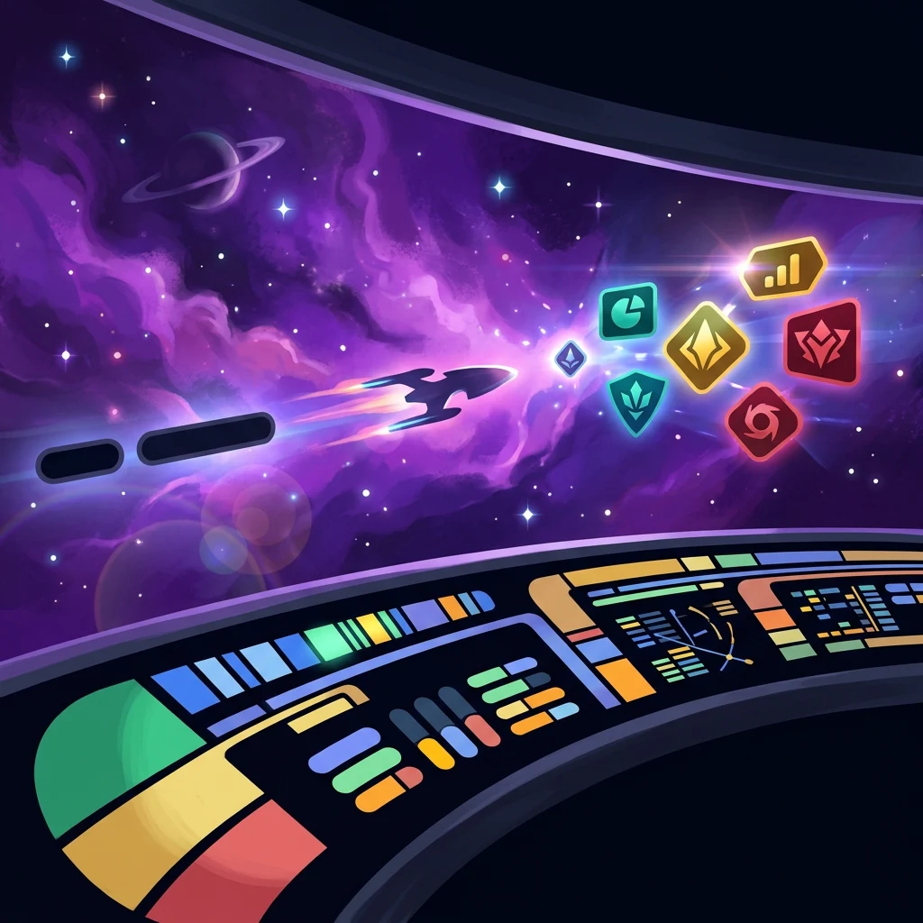
Asymmetric corners and chevrons, for anyone who has wanted their docs to look like a starship:
Command Console Theme
Retro-futuristic command interface
.qaid-theme-lcars {
  width: 56px;
  height: 56px;
  border: none;
  color: #000;
  transition: all 0.2s ease;
  position: relative;
  overflow: hidden;
}

.qaid-theme-lcars::before {
  content: '';
  position: absolute;
  top: 0;
  left: 0;
  right: 0;
  height: 3px;
  background: linear-gradient(90deg, transparent, rgba(255,255,255,0.5), transparent);
}

.qaid-theme-lcars::after {
  content: '';
  position: absolute;
  inset: 0;
  background: linear-gradient(180deg, transparent 60%, rgba(0,0,0,0.15));
  pointer-events: none;
}

.qaid-theme-lcars:hover {
  transform: scale(1.05);
}

.qaid-theme-lcars .qaid-icon {
  width: 28px;
  height: 28px;
  filter: drop-shadow(0 1px 1px rgba(0,0,0,0.3));
  position: relative;
  z-index: 1;
}

.qaid-theme-lcars.qaid-btn-up {
  background: linear-gradient(135deg, #99ccff 0%, #0099aa 100%);
  border-radius: 1.5rem 0 0 0;
  box-shadow:
    0 0 20px rgba(0,204,255,0.3),
    inset 0 1px 0 rgba(255,255,255,0.3);
}

.qaid-theme-lcars.qaid-btn-down {
  background: linear-gradient(135deg, #cc99cc 0%, #7733aa 100%);
  border-radius: 0 0 1.5rem 0;
  box-shadow:
    0 0 20px rgba(153,102,204,0.3),
    inset 0 1px 0 rgba(255,255,255,0.3);
}
import { QaidFeedback } from '@qaiddev/thumbs-embed';
new QaidFeedback({
endpoint: '/api/feedback',
buttonClass: 'qaid-theme-lcars',
colors: {
positive: '#00ccff',
negative: '#9966cc'
},
positiveIcon: '<svg xmlns="http://www.w3.org/2000/svg" class="qaid-icon" fill="none" viewBox="0 0 24 24" stroke="currentColor" stroke-width="3"><path stroke-linecap="round" stroke-linejoin="round" d="M4.5 15.75l7.5-7.5 7.5 7.5"/></svg>',
negativeIcon: '<svg xmlns="http://www.w3.org/2000/svg" class="qaid-icon" fill="none" viewBox="0 0 24 24" stroke="currentColor" stroke-width="3"><path stroke-linecap="round" stroke-linejoin="round" d="M19.5 8.25l-7.5 7.5-7.5-7.5"/></svg>'
});Each corner radius is set on its own, rounded hard on one side and square on the other, the way those panels always were. Chevrons instead of thumbs keep it on theme without borrowing anybody's trademarks.
Applying one
The Customizer on the homepage will generate this for you, or write it yourself:
<!-- Add the theme CSS to your stylesheet -->
<style>
.qaid-theme-neon {
  background: #0a0a0a;
  border: 2px solid currentColor;
  border-radius: 12px;
  /* ... rest of theme CSS */
}
</style>

<!-- Configure the embed with the theme class -->
<script
  src="https://unpkg.com/@qaiddev/thumbs-embed/dist/embed.js"
  data-endpoint="/api/feedback"
  data-button-class="qaid-theme-neon"
  data-positive-color="#00ff88"
  data-negative-color="#ff0066"
></script>
data-button-class is the part that matters. It names the class your CSS targets.
Building one in the dashboard
You can write the CSS by hand. You mostly won't. Every project has a Customize page: pick a preset, push the colours, position, size and type around, and watch the preview keep up. Save it to the project and copy the snippet out.
Open it from Projects → your project → Customize. The preset grid on the left (Default, Neon, Minimal, Command Console, Emoji, Hearts and a dozen more) is your starting point. Colors, Position & Style, and Modal & Typography sit underneath. On the right, a live preview runs next to the exact <script> tag you paste into your site, so what you approve is what ships.
Where to go next
A preset gets you 80% of the way. Brand color matching covers the last stretch: driving the three colour settings from your own palette, and checking the result still passes contrast.